Rooted in Story.
A Brand Reborn: Rooted in Story, Steeped in Meaning
Rebranding is more than just a fresh coat of paint, it’s a homecoming. A return to what matters most. Over the past few months, I’ve taken a long, thoughtful look at the heart of what I offer and who I am, and what you see today is the result of that journey.
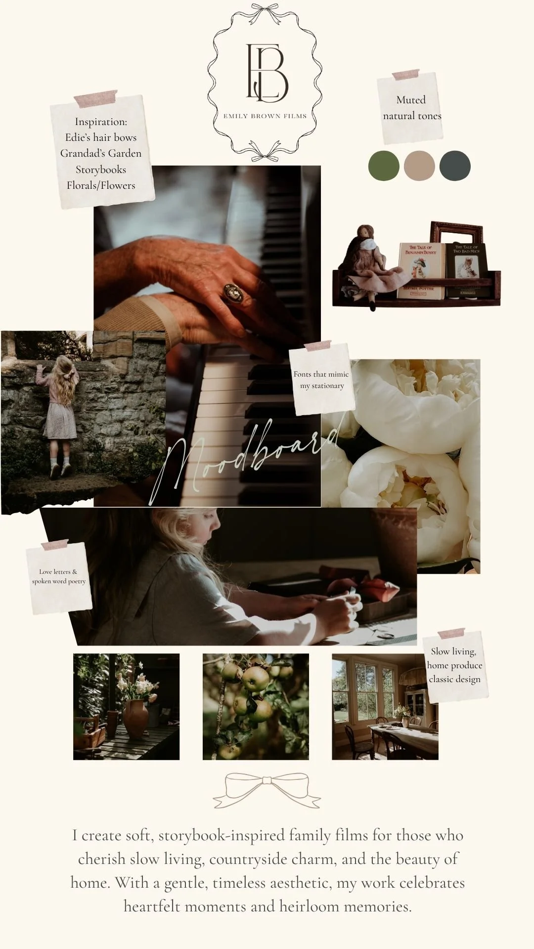
Every part of this new brand, every colour, word, and motif has been chosen with intention. Not just to look beautiful (though I hope it does), but to feel true. To reflect the kind of experience I want to create for you, and the kind of legacy I want to help you curate.
The soul of this brand is deeply personal. It’s shaped by memory and meaning.
The garden at the centre of it all? It began with my grandad’s. A place where everything felt still and slow. Where I first noticed the light falling softly through apple trees and we’d play for hours. That garden has never really left me and it continues to serve as a huge inspiration to me. It’s in every frame I shoot, every story I tell. It taught me to notice.
The bow motif is inspired by my daughter her gentle, playful love of bows, the way she wears them with pride, the way they speak so sweetly to girlhood. To that fleeting magic we try so hard to hold onto. It felt only right that a symbol of her be woven into this brand and into the stationary I have lovingly developed.
Fonts were chosen not only for their visual beauty, but for the way they feel. There’s a quiet rhythm to them, echoing handwritten scripture and the kind of script you might find in old letters or well-worn books, post cards and little reminders. I wanted the words here to feel lived in, familiar, and full of warmth.
Speaking of words, so many are drawn from the pages of poems, versus and storybooks. Language, like imagery, holds power. The phrases and titles you’ll find here have been carefully gathered to evoke feeling, not just function. A sense of wonder, of nostalgia, of quiet reflection.
The colour palette reflects the world of my films. Soft, muted hues—ivory, sage, dusty rose, pale gold. The colours of countryside kitchens, faded florals, sun-washed linens. These are tones I return to again and again in my work. They create calm. They feel like home and they ensure the focus is on the beautiful interactions we all want to remember.
Even the florals that weave through this new visual identity were inspired by my wedding bouquet, adding another thread of personal history. Another nod to love, legacy, and the meaningful milestones that shape us.
This brand isn’t just a new look. It’s an offering. A way of inviting you into a world where stories are slow, light is golden, and meaning is everywhere.
Thank you for being here. For growing with me. For valuing not just the product, but the process. I hope this new chapter feels just as tender, thoughtful, and true as the stories I’m so lucky to tell.
